Launch date
August 17th, 2015 (preview release)
Problem
ConnectExplorer is a web application that helps users navigate Pictometry’s high resolution aerial imagery and allows them to use measurement and analysis tools, as well as their GIS data. There was a company need to elevate the application’s user interface to make it easier to use and visually pleasing.
Solution
The user interface was reorganized and simplified.
Screenshots
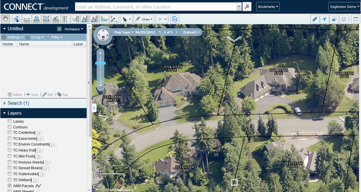
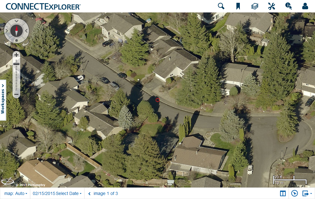
Images of process (more coming soon)
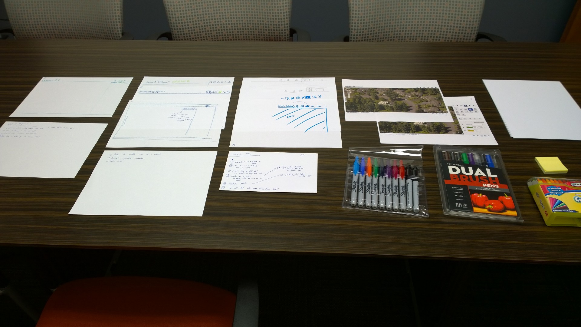
What I did
- Redesigned entire UI
- Advocate for a shift in product management model to include UX, the training team and user studies as part of the process from a user advocacy perspective
- Design studio sessions, customer interviews, first-click analysis, prototype development for guerilla user testing
- Prioritized design and interaction model changes after observing users use the tool
- Mocked up and prototyped ideas to share with team and stakeholders
- Work closely with product owner and development team to make interactions more consistent and to come up with simpler solutions that were technically feasible and met timelines
- Assisted in creating of customer survey for pre-release
- Asset creation
Tools used
- Design methods: customer interviews, first click analysis, clickable prototypes, (guerrilla) user testing, research audiences, adhoc personas (created by somebody else), surveys, sketching, white boarding. wireframes, design review
- Design tools: Pen/Paper, Whiteboard, Balsamic, Fireworks, InVision App, Chalkmark (first click analysis), Firebug (yeah, as a design tool)
- Communication: Skype, WebEx, GotoMeeting, Google Hangouts